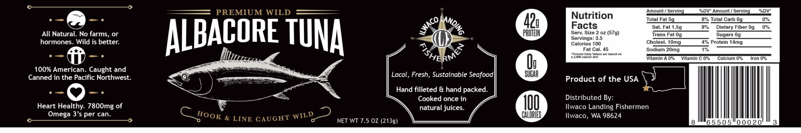
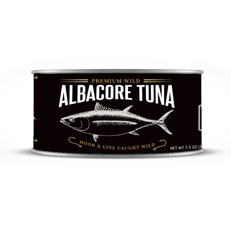
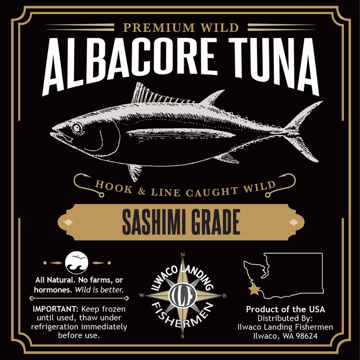
Ilwaco Landing Fishermen, with a legacy spanning over 125 years, sought a label refresh for two distinct packages: a classic tuna can and a premium loin package. The objective was to balance tradition and signify high-end tuna through a design that resonated with the brand’s rich history.
Industry:
Retail
Category:
Design & Branding
Client:
Off the Wall Media
Date:
2016
BeforeAfter
Before & After Slider of old label vs my new design
Challenge
The challenge was twofold—capturing a century of history in two label designs while differentiating the products. Standing out in the blue-toned tuna market required a unique approach, striking a balance between Ilwaco Landing’s long tradition and the premium quality of the tuna.
Approach
The approach focused on blending tradition with sophistication. Vintage aesthetics conveyed Ilwaco Landing’s enduring spirit, while a distinct color palette and graphics set the product apart from common blue-toned designs, creating a visual identity that echoed history and quality.
Results
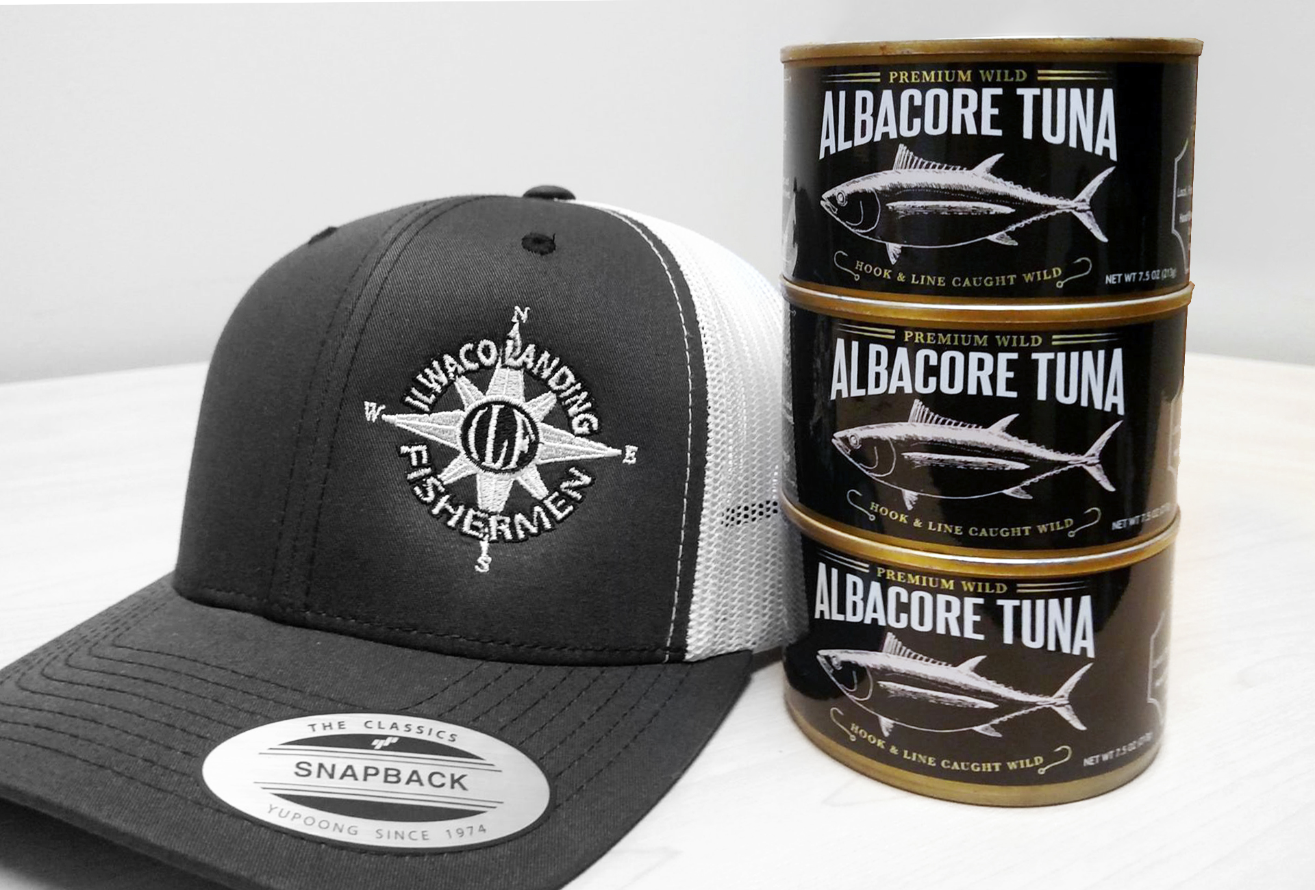
The result was a successful fusion of tradition and sophistication in two distinct label designs. The vintage-inspired aesthetic captured Ilwaco Landing’s essence, and the unique color palette signaled premium quality, setting the products apart in the competitive tuna market. The refreshed labels provided a compelling shelf presence, revitalizing Ilwaco Landing Fishermen’s brand in the marketplace. (It should be noted that in 2017 Fishpeople Seafood acquired Ilwaco Landing Fishermen, adding a new chapter to its history.)