Catholic Charities Website Design & Development
Project Summary
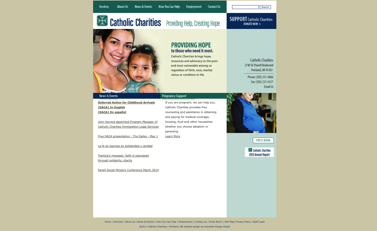
The user-centric approach to the website overhaul for Oregon Catholic Charities involved a meticulous reorganization, ensuring a seamless experience for diverse stakeholders. Operating within a national program with individual state governance, the challenge was not only to meet national branding standards and embody a modern, friendly aesthetic but also to prioritize user experience, especially considering the varied personas and the need for optimization on slow internet speeds. Navigational simplicity was emphasized to cater to users seeking assistance with English as a second language, volunteers, donors, and various other stakeholders, aligning the design with the organization’s commitment to inclusivity and accessibility.
-
Industry:
Non-profit
-
Category:
Design & Coding
-
Client:
Stellaractive
-
Date:
2016


Challenge
In crafting the website for a local non-profit, a user-centric approach was paramount. Recognizing the diverse range of user personas, including those seeking language assistance, volunteers, and donors, the design prioritized intuitive navigation and accessibility. The challenge of slow internet speeds was addressed through streamlined, user-friendly interfaces, ensuring a seamless experience. Balancing modern, friendly design elements considered the varied audience, emphasizing visual clarity and simplicity. This approach also navigated the delicate task of aligning with the existing logo while preparing for an upcoming redesign, strategically ensuring a smooth transition and maintaining a cohesive and engaging user experience.
Approach
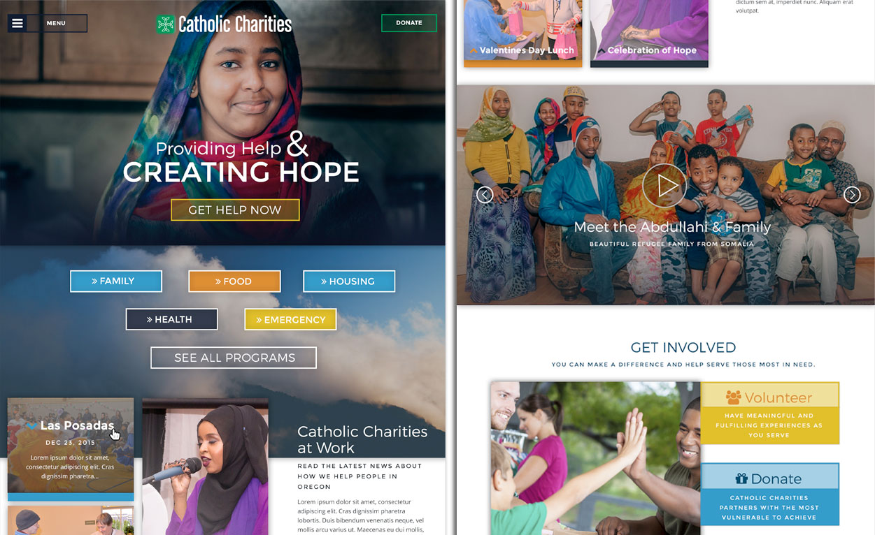
The approach involved a strategic blend of modern aesthetics and user-centric design, acknowledging the dual needs of representing a vast organization and catering to state-specific information. Not only did I design this overhaul, but I also coded a custom WordPress theme which incorporated complimentary gradient colors via advanced CSS to align with the existing logo while ensuring a cohesive visual experience. The biggest emphasis was on simplicity in navigation to accommodate various users and their objectives.
Results
The results were a successfully revamped website that met the diverse needs of Oregon Catholic Charities. The contemporary gradient design not only aligned with the organization’s goals but also accommodated state-specific information. The use of gradient colors provided visual continuity, laying the groundwork for a seamless transition with the upcoming logo redesign. The optimized site not only showcased the organization’s offerings effectively but also ensured accessibility for users across varied internet speeds.


